Predictive maintenance via Knime - Exploratory Data Analysis (Part 2)

In the previous part of the blog, we saw how to read data from text files and preprocess it.
Do have a look at the previous block before processing further. Now in this part, we will see the EDA for Anomaly Detection for predictive maintenance.
Exploratory data Analysis(EDA)
Exploratory data analysis is the crucial process of doing first investigations on data in order to find patterns, identify anomalies, test hypotheses, and validate assumptions using summary statistics and graphical representations.
Data scientists use exploratory data analysis (EDA), which frequently makes use of data visualization techniques, to examine and analyze data sets and summarise their key properties. It makes it simpler for data scientists to find patterns, identify anomalies, test hypotheses, or verify assumptions by determining how to modify data sources to achieve the answers they need.

Exploratory data analysis
EDA is primarily used to see what data can reveal beyond the formal modeling or hypothesis testing task and provides a better understanding of data set variables and the relationships between them.
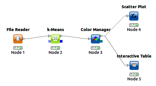
We will be using a CSV reader node to read the alligndata.csv files. We can also directly give input from read all nodes after it is fully executed.

Similar output is obtained from reading all nodes.

KNIME workflow for EDA
Now that we have data preprocessing, we can start to look for visual patterns as hints of the imminent rotor breakdown. We demonstrate this for one sensor (A1-SV3) using the following visualizations:
Line plot

Line plot
Line plot reveals trends and seasonality.
A line plot shows the amplitude values against time. By looking at the line plot, we can identify a trend, seasonality, long term cycles, outliers, turning points, and gaps.
The figure shows two line plots with the amplitude values on the [0,100Hz] (top) and [500,600Hz] (bottom) frequency bands. The amplitude values on the [0,100Hz] frequency band are not different before and after the rotor breakdown on July 21, 2008, so this frequency band doesn’t seem to be affected by the deteriorating rotor at all.
On the [500,600Hz] frequency band the amplitude values get higher and higher until July 21, 2008, and then there’s a gap. So this frequency band seems to be more informative of a rotor malfunctioning. At the right end of the line plot, you can see that the amplitude values on this frequency band returned to a low level after the rotor malfunctioning was rectified.

Scatter matrix
Scatter matrix showing the relationships between amplitude values on three different frequency bands. The red dots represent the time before the rotor breakdown, blue and green dots represent the time of normal functioning.

Heatmap
Correlation Matrix
The figure below shows the correlation matrix of the frequency bands as a heatmap during the training window (top) and the maintenance window (bottom). On the x- and y-axes are the column names, i.e the frequency bands. The cells indicate the correlation between the columns defined by the x- and y-coordinates. The colors indicate the strength and type of the correlation: Blue for strong negative correlation, white for weak correlation, and red for strong positive correlation.
During the training window, the correlation matrix is quite colorful. This means that when the rotor is functioning normally, some frequency bands are positively correlated, some negatively correlated, and others not at all.
During the maintenance window, the correlation matrix is almost fully red, and a strong positive correlation between all frequency bands seems to be a sign of the rotor malfunctioning.


Auto-correlation Matrix
The image below shows the auto-correlation matrix of the [300–400Hz] frequency band. In the auto-correlation matrix, the columns on the x- and y-axis indicate past values at different lags from 1 to 10. Before building the auto-correlation matrix, we used the Lag Column node. This node puts the past values of the input column into the same data row as the current value, each lag into a separate column.
During the training window (the top heatmap), the right end of the first row is almost white, so there’s hardly any auto-correlation after the 5th lag. During the maintenance window (the bottom heatmap), the correlation matrix is fully red, which means that the auto-correlation becomes much stronger on this frequency band as the rotor starts malfunctioning.


So till now, we pre-processed and visually explored FFT-processed time series data from a network of sensors monitoring a working rotor, which features a breakdown episode on July 21, 2008. We averaged the spectral amplitudes by date and frequency bin and performed time alignment of the data coming from different sensors.
We explored the time series evolution using five different visualization techniques: line plot, scatter matrix, heat map, correlation matrix, and auto-correlation matrix. Our visualizations clearly show the advent of the breakdown episode in some of the frequency bands.
Time alignment, frequency binning, and visual exploration are not uncommon procedures in the analysis of sensor data. The steps described here could easily be reused for other IoT applications.
After cleaning the data and visually exploring normal functioning, the next step would be to predict the breakdown episode from no other examples than the available data history of normal functioning, with simple and complex analytics techniques.
I hope this article was informative and provided you with the details you required. If you have any questions while reading the blog, message me on Instagram or LinkedIn. Special credits to my team interns: Shreyas, Siddhid, Urvi, Kishan, Pratik.
Thank You…


